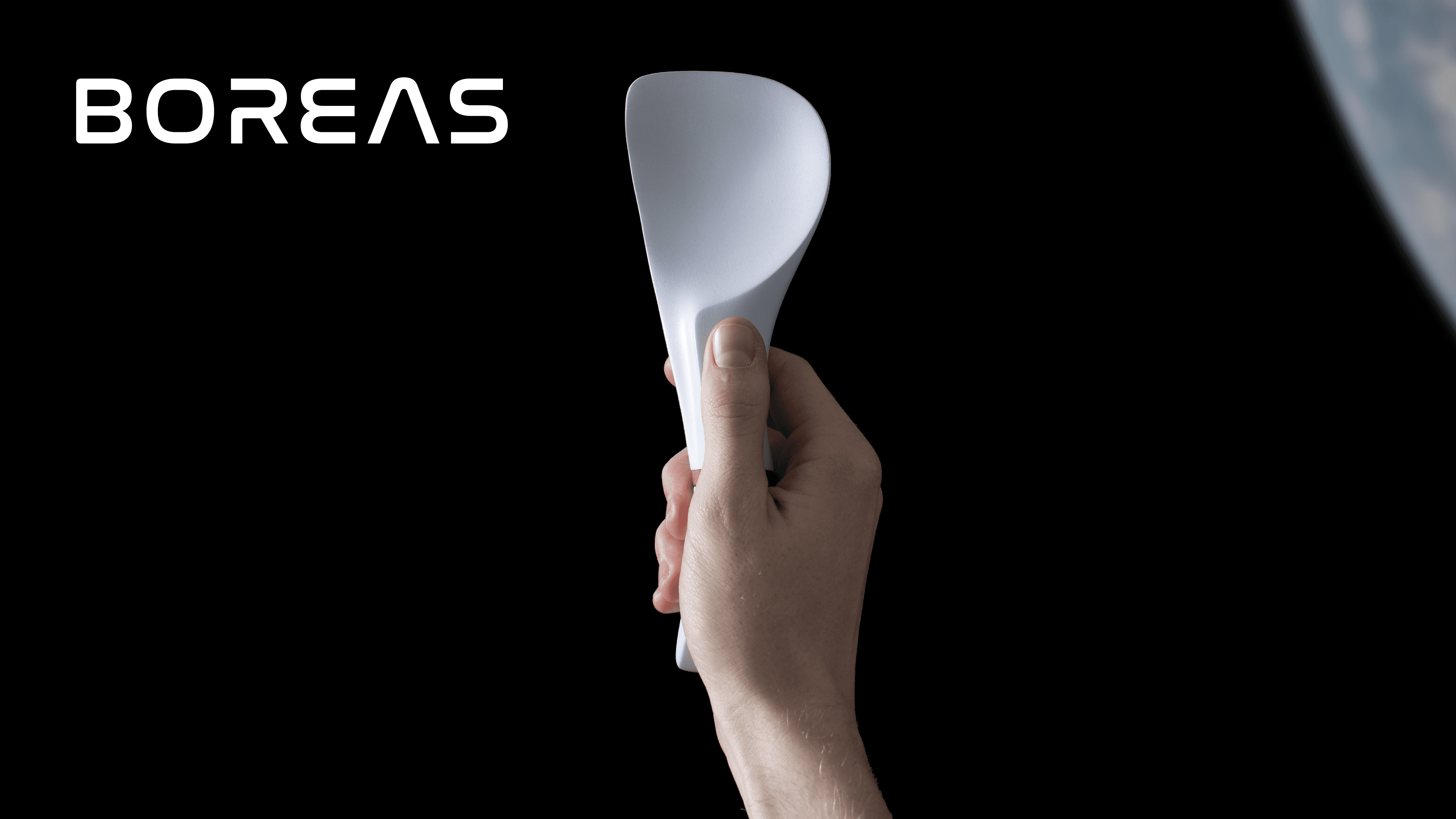
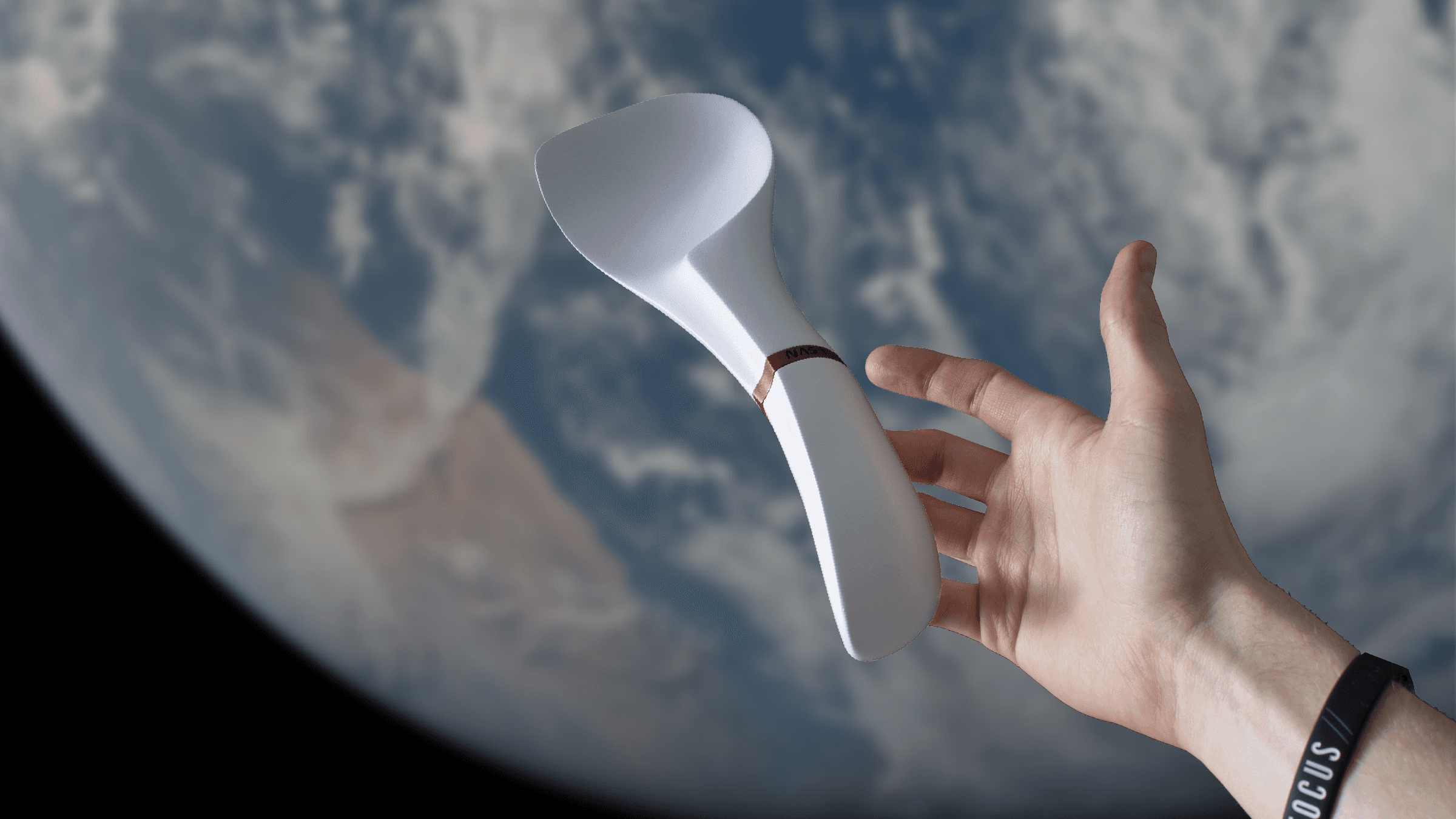
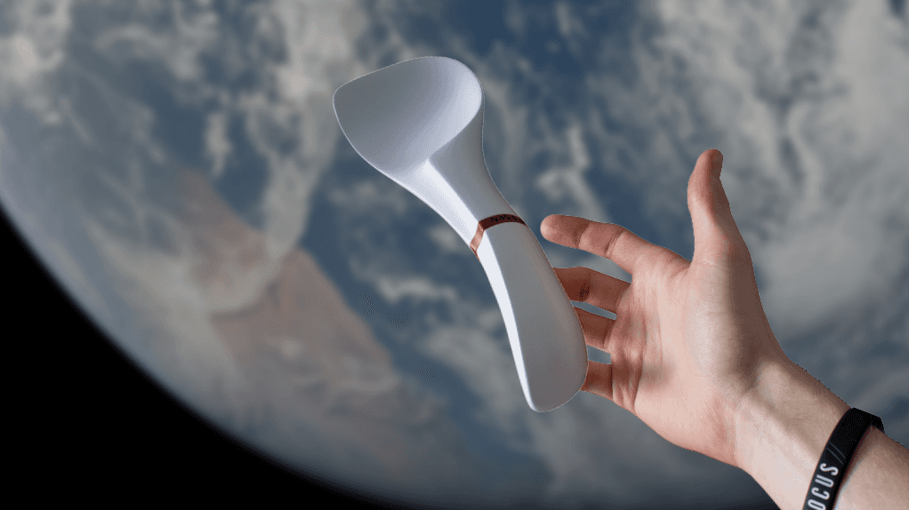
one small scoop for man
overview
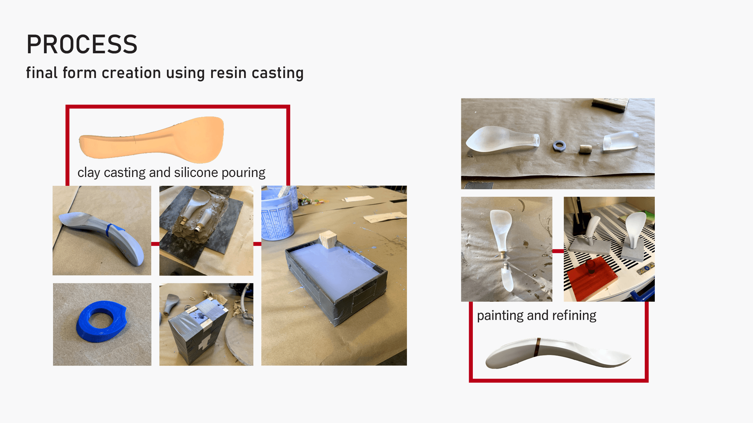
One Man's Trash
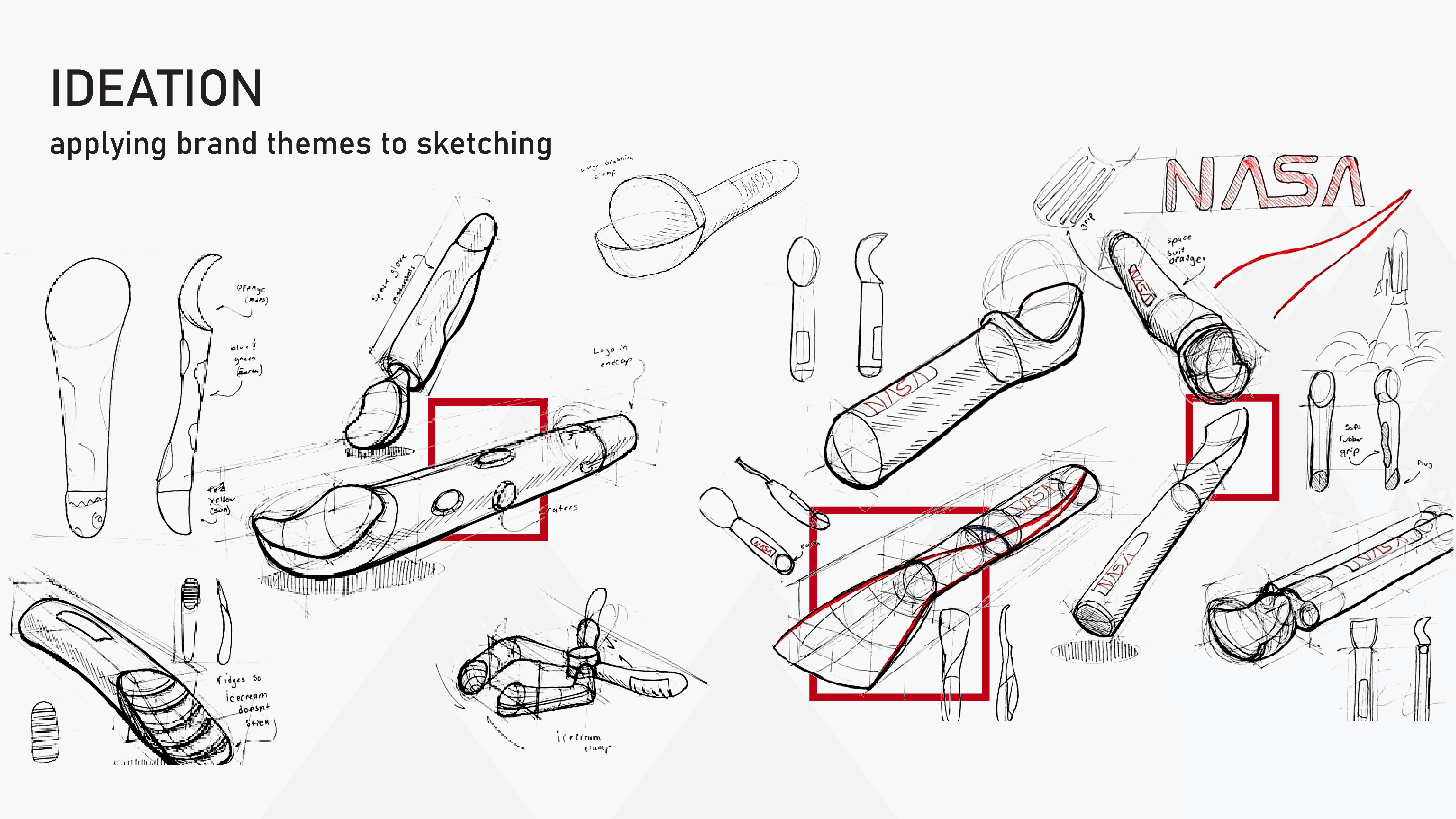
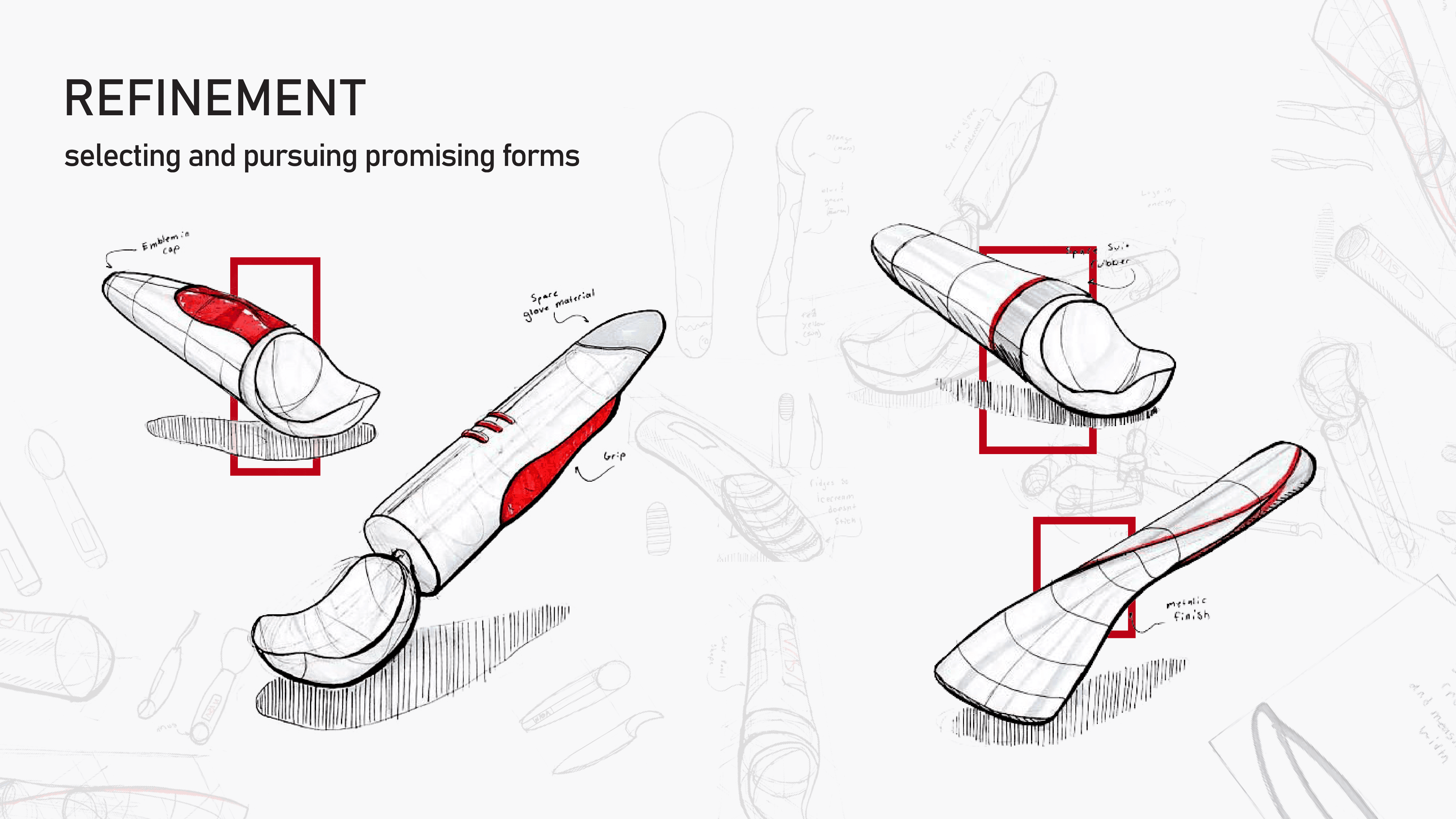
The NASA brand is iconic, recognizable, and simple, so naturally, I fell in love with the iconography and type face. So while reading the NASA graphics manual might seem boring to some… I actually quite enjoyed it… I only read the online version, but the physical ones come in such a cool package ->

key takeaways

Simplicity
Avoid clutter, don't use any more than is necessary

Graphic Impact
Highly visible & easily identified from all angles

Harmony of Form
Graphics respond to the shape of the craft they are applied to